
I hope you didn’t miss the article on visualization from the Harvard Business Review. It is called ‘Vision statement: How to lie with charts‘, and it’s full of clear stated examples.
Source: Wikipedia
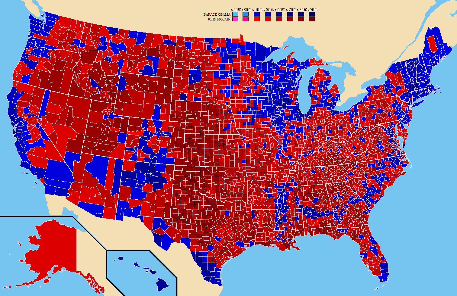
This color-coded map is one of the examples they show where coloring a county with the political color of the majority vote in that state is misleading. The map represents the 2008 election (Obama versus McCain) and we can see 80% of the US colored in red (the Republican color), and in fact the Republican candidate John McCain received only 40% of the votes. The mismatch of the (natural) election’s expectation after looking at this map and the real outcome comes from representing in a map information that is not related to geography. The number of votes in a county or a state is not proportional with its geographical size.
[..] you could call it the New York City problem -0,01% of the area but 2,7% of the population.
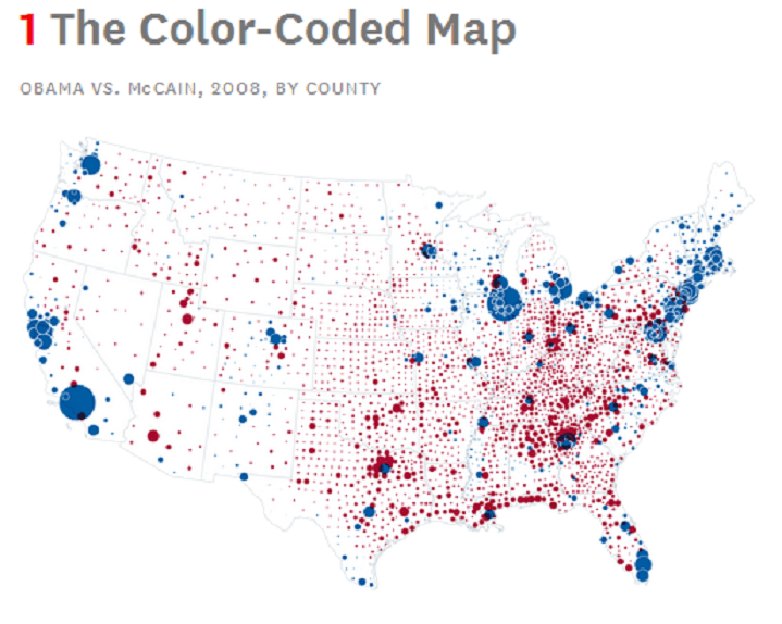
A suggested better representation is using bubbles with sizes proportional of the number of votes, ending with this map showing more correctly a majority of blue instead.
Source: hbr.org
Visualization is growing in importance nowadays that we have so much data all around. Visualization can help to identify trends, to find patterns, to show relations between data. It can show what the data represents, putting it in an intuitive way.
But as this article shows, used in a wrong way, visualization can mislead you just as well.
To be on the safe side, it’s better to check the numbers or data behind the representation in order to confirm what the image is showing you … or if somebody is not tricking you!
